
Full Page Screenshots for Website in Browsers
- 420
- 0


When it comes to the word “design”, we often think of visual design first. But the texts that appear in a product are also a part of the design – and just as important. Not because these small texts should stand out, but because they should not do so at the moment. Whether a website or app, people do not use a product to read the interface texts in it. They use it to do something. That’s what UX writing is all about.
Have you ever thought about what an app or website you need every day would look like without text? Probably there wouldn’t be too much left. This is what it would look like if you want to log in to your Outlook account.

That looks pretty empty. In fact, without text, it is difficult to know what to do here. What is missing is UX Writing: the small but important texts that are part of the design and help us to get around. Without these texts, it is not possible to use Outlook. The design no longer works. It is, therefore, worth paying as much attention to these texts during the design and development phase as, for example, visual design.
Torrey Podmarjersky’s book “Strategic Writing for UX” offers a great introduction to UX writing. We highly recommend the book. For this reason, we have summarized some of the points Torrey raises. Here are five ways you can (still) make your product better through UX writing.
It may sound simple, but it is an absolute must: the texts in your product must be accessible. If the people who want to use your product can’t read or understand the text, then the whole product fails. To avoid this, pay attention to these three points:
As we said, this sounds a bit banal. Especially in larger projects, however, it is helpful to establish a systematic system to keep an overview of which texts, for example, have not yet been translated or are only available as draft texts.
The goal is that your texts allow users to do what your product is meant for in such a way that it also serves your company. There’s a simple question to check if your content is effective:
Can [our users] do [their job] and does that lead to [our company’s goals]?
Let us take Booking.com as an example. Someone could come to the site to find a cheap hotel. This is the task that this user is trying to accomplish. However, Booking.com’s goal goes beyond this task: the company probably not only wants this person to find a cheap hotel but also to book it via Booking.com (instead of, for example, going to the hotel’s website and booking there). Target texts should support these two goals together – that of the user and that of the company.
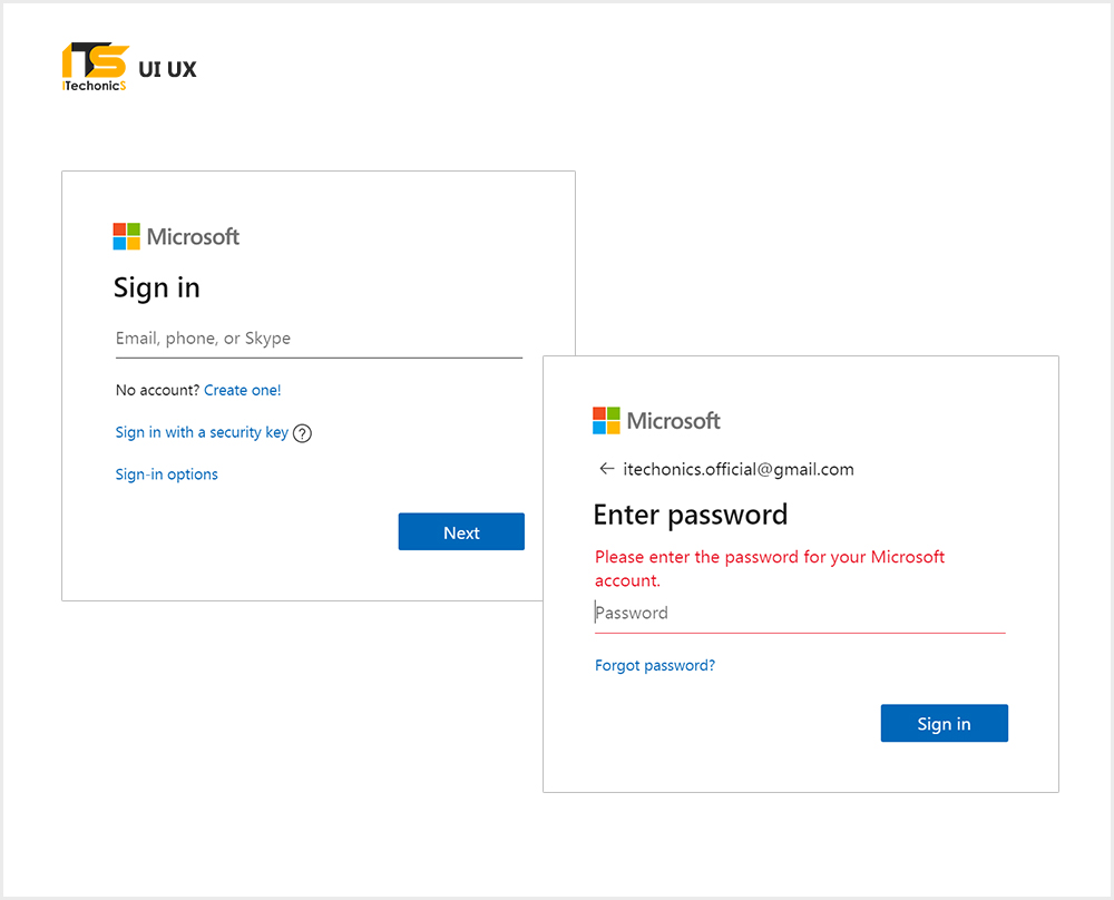
Microsoft handles this especially nicely on the outlook login entry page.

Existing users can access their account quickly and directly (1), but are also made aware of the premium version (2). Last but not least, new customers are also picked up and invited to create a free account (3). The three CTAs work because they connect potential users to possible Microsoft goals:
It should have just enough text in your product that users can perform their tasks efficiently and satisfactorily. No more and no less. In concrete terms, this means:
This second point may sound extreme. Shorter texts are better because they are easier to fly over, as Torrey Podmajersky explains. our own observations in usability tests confirm that people tend to perceive longer texts as more complex, even if they are not more complex at all.
Conversation-oriented does not mean that you should strike as informal a tone as possible or that you have to write “you” everywhere. Rather, it’s about making texts easy for users to understand – as simple as talking to another person. Pay attention to the following:
To examine this second point, it may be helpful to really talk through the texts like a conversation. This shows the order of each text. Because while we can display multiple options on one screen at the same time without worrying about their order, we are forced to say an option of it first.
The texts should be self-explanatory so that users are always clear about where they are and what they can do. In case of a doubt, help should be available. In concrete terms, this means:
Of course, error messages and help texts would ideally not be necessary. In reality, however, they will sooner or later be used – at the very moment when users must understand what we want to tell them. In the design process, error messages are frictional moments, which can always inspire us to consider how a user could get into this situation and whether we could avoid this situation in the first place through text and design.
Texts should therefore be accessible, purposeful, concise and concise, conversation-oriented, and clear. So what does that mean in action? Let’s look again at the Outlook login, this time with the text.
This last point shows that although it is helpful to look at individual interface texts in detail, these texts must ultimately be put into context: What happens beforehand? What after? If we look at texts holistically, it is also striking that these five aspects can conflict with each other: is it better to shorten a call-to-action text so as not to use more than 3 words, or should we rather use a word more to express more clearly what it is all about?
You sometimes hear the tip “short beats good” to say that in case of doubt, shorter is better. There is a more sensible way to choose between two text variants: in case of doubt, the variant is better, which helps our users. Sometimes this angle of view already helps to discard a text. If not, it might be worth doing usability testing or some other study to see which text variant users really understand better – and then adapt the text iteratively.
Is UX Writing really that important? In short, yes. Not because these small texts should stand out, but because they should not do so at the moment. Whether a website or app, people do not use a product to read the interface texts in it. They use it to do something: book a hotel, make a payment, or do a job. All texts should be written in such a way that they support this task – and that is why UX Writing is so important.
To tackle UX Writing correctly, you need a person in the project team who takes on the texts and takes responsibility for them. It is best to involve this person as early as possible so that the texts can be developed with the product and its design. Because if we realize just before launch that the structure and the sequence of the texts do not work, then it is difficult to fix this by the mere wording of a button.
Conversely, a focus on text material can also reveal new options to make the entire product better. And from a business point of view, the right choice of words can, for example, increase conversion by communicating the necessary information to users exactly when they need it.
UX writing is still a relatively new topic. As an introduction, we highly recommend Torrey Podmajersky’s book “Strategic Writing for UX”. A slightly older book on the subject is Ginny Redish’s “Letting Go of the Words”. Ginny Redish gives valuable tips on how not only short interface texts but also longer texts can be strategically designed (e.g. information pages or blog articles). Thirdly, we recommend the “Readability Guidelines Handbook” by Content Design London. The short manual offers good 80 recommendations for writing texts that are simple and readable.


Comments